一、基本用法
使用 type、plain、round 和 circle 来定义按钮的样式。
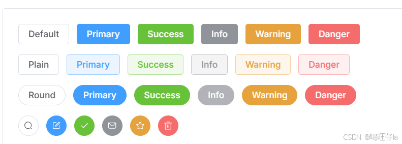
样式代码如下:
<template><div class="mb-4"><el-button>Default</el-button><el-button type="primary">Primary</el-button><el-button type="success">Success</el-button><el-button type="info">Info</el-button><el-button type="warning">Warning</el-button><el-button type="danger">Danger</el-button></div><div class="mb-4"><el-button plain>Plain</el-button><el-button type="primary" plain>Primary</el-button><el-button type="success" plain>Success</el-button><el-button type="info" plain>Info</el-button><el-button type="warning" plain>Warning</el-button><el-button type="danger" plain>Danger</el-button></div><div class="mb-4"><el-button round>Round</el-button><el-button type="primary" round>Primary</el-button><el-button type="success" round>Success</el-button><el-button type="info" round>Info</el-button><el-button type="warning" round>Warning</el-button><el-button type="danger" round>Danger</el-button></div><div><el-button :icon="Search" circle /><el-button type="primary" :icon="Edit" circle /><el-button type="success" :icon="Check" circle /><el-button type="info" :icon="Message" circle /><el-button type="warning" :icon="Star" circle /><el-button type="danger" :icon="Delete" circle /></div>
</template><script lang="ts" setup>
import {Check,Delete,Edit,Message,Search,Star,
} from '@element-plus/icons-vue'
</script>
二、禁用状态
可以使用 disabled 属性来定义按钮是否被禁用。
使用 disabled 属性来控制按钮是否为禁用状态。 该属性接受一个 Boolean 类型的值。
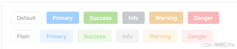
样式代码如下:
<template><div class="mb-4"><el-button disabled>Default</el-button><el-button type="primary" disabled>Primary</el-button><el-button type="success" disabled>Success</el-button><el-button type="info" disabled>Info</el-button><el-button type="warning" disabled>Warning</el-button><el-button type="danger" disabled>Danger</el-button></div><div><el-button plain disabled>Plain</el-button><el-button type="primary" plain disabled>Primary</el-button><el-button type="success" plain disabled>Success</el-button><el-button type="info" plain disabled>Info</el-button><el-button type="warning" plain disabled>Warning</el-button><el-button type="danger" plain disabled>Danger</el-button></div>
</template>
三、链接按钮
新的 API link 于 2.2.1 版本时添加,你可以使用 type API 设置链接按钮的主题样式

样式代码如下:
<template><p>Basic link button</p><div class="mb-4"><el-buttonv-for="button in buttons":key="button.text":type="button.type"link>{{ button.text }}</el-button></div><p>Disabled link button</p><div><el-buttonv-for="button in buttons":key="button.text":type="button.type"linkdisabled>{{ button.text }}</el-button></div>
</template><script setup lang="ts">
const buttons = [{ type: '', text: 'plain' },{ type: 'primary', text: 'primary' },{ type: 'success', text: 'success' },{ type: 'info', text: 'info' },{ type: 'warning', text: 'warning' },{ type: 'danger', text: 'danger' },
] as const
</script>
四、文字按钮
文字按钮在现在有了全新的设计样式。 2.2.0 如果您想要使用老版样式的按钮,可以考虑使用 Link 组件。
API也已更新,由于 type 属性会同时控制按钮的样式, 因此我们通过一个新的 API text: boolean 来控制文字按钮。
五、图标按钮
使用图标为按钮添加更多的含义。 你也可以单独使用图标不添加文字来节省显示区域占用。
使用 icon 属性来为按钮添加图标。 您可以在我们的 Icon 组件中找到所需图标。 通过向右方添加<i>标签来添加图标, 你也可以使用自定义图标。
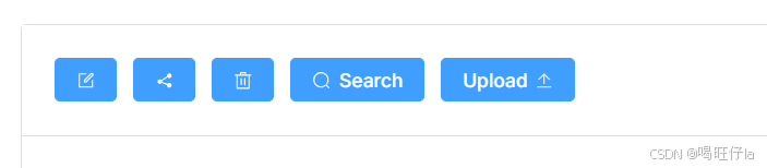
样式代码如下:
<template><div><el-button type="primary" :icon="Edit" /><el-button type="primary" :icon="Share" /><el-button type="primary" :icon="Delete" /><el-button type="primary" :icon="Search">Search</el-button><el-button type="primary">Upload<el-icon class="el-icon--right"><Upload /></el-icon></el-button></div>
</template>
<script setup lang="ts">
import { Delete, Edit, Search, Share, Upload } from '@element-plus/icons-vue'
</script>
六、按钮组
以按钮组的方式出现,常用于多项类似操作。
使用 <el-button-group> 对多个按钮分组。
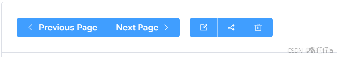
样式代码如下:
<template><el-button-group><el-button type="primary" :icon="ArrowLeft">Previous Page</el-button><el-button type="primary">Next Page<el-icon class="el-icon--right"><ArrowRight /></el-icon></el-button></el-button-group><el-button-group class="ml-4"><el-button type="primary" :icon="Edit" /><el-button type="primary" :icon="Share" /><el-button type="primary" :icon="Delete" /></el-button-group>
</template><script setup lang="ts">
import {ArrowLeft,ArrowRight,Delete,Edit,Share,
} from '@element-plus/icons-vue'
</script>
七、加载状态按钮
点击按钮来加载数据,并向用户反馈加载状态。
通过设置 loading 属性为 true 来显示加载中状态。
八、调整尺寸
除了默认的大小,按钮组件还提供了几种额外的尺寸可供选择,以便适配不同的场景。
使用 size 属性额外配置尺寸,可使用 large和small两种值。
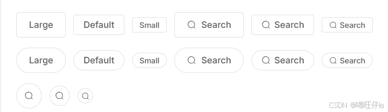
样式代码如下:
<template><div class="flex flex-wrap items-center mb-4"><el-button size="large">Large</el-button><el-button>Default</el-button><el-button size="small">Small</el-button><el-button size="large" :icon="Search">Search</el-button><el-button :icon="Search">Search</el-button><el-button size="small" :icon="Search">Search</el-button></div><div class="flex flex-wrap items-center mb-4"><el-button size="large" round>Large</el-button><el-button round>Default</el-button><el-button size="small" round>Small</el-button><el-button size="large" :icon="Search" round>Search</el-button><el-button :icon="Search" round>Search</el-button><el-button size="small" :icon="Search" round>Search</el-button></div><div class="flex flex-wrap items-center"><el-button :icon="Search" size="large" circle /><el-button :icon="Search" circle /><el-button :icon="Search" size="small" circle /></div>
</template><script setup lang="ts">
import { Search } from '@element-plus/icons-vue'
</script>
九、Tag
可以自定义元素标签。例如,按钮,div,路由链接,nuxt链接。
十、自定义颜色
可以自定义按钮的颜色。
我们将自动计算按钮处于 hover 和 active 状态时的颜色。